As we navigate through 2026, the digital landscape has shifted toward even more immersive, AI-driven, and multi-device experiences. Yet, despite the rise of spatial computing and neural interfaces, one truth remains constant: communication is the heartbeat of the web. With over 95% of online information still conveyed through written language, the way we style that text typography is no longer just a design choice; it is a critical component of user accessibility and cognitive ease.
In this era of Tactile Maximalism and Agentic AI, typography has evolved from static characters to dynamic assets. Modern interfaces now demand Variable Fonts that adapt their weight and width in real-time based on ambient lighting or user gaze. We are seeing a strategic "return to human" with Organic Typography and "imperfect" hand-drawn styles that counter the sterile polish of early AI-generated content. Furthermore, as Spatial Design becomes mainstream, text must now maintain legibility across three-dimensional environments, where depth and viewing angles are as important as pixel density.
Optimizing your type in 2026 is no longer just about beauty; it is about reducing cognitive load in an overstimulated world. By mastering these evolving standards, you ensure that your message doesn't just exist on a screen but resonates with a global audience across every possible digital touchpoint.
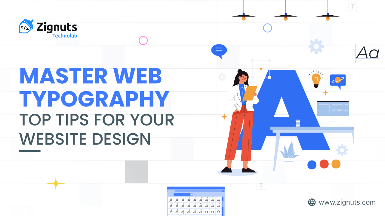
10 Tips for Web Typography and Best Web Typefaces for Website Design
1. Keep the Number of Fonts Used to a Minimum Web Typography
Using more than three different fonts makes a website look unstructured and unprofessional. Keep in mind that too many type sizes and styles at once can also wreck any layout. To prevent this, try to limit the number of font families to a minimum, ideally sticking to two (one can often suffice). Consistency is key; maintain the same choices throughout the entire project. If multiple families are necessary, ensure they complement each other based on their character width.
In the 2026 design landscape, this rule has become even more critical due to the rise of Variable Fonts. Instead of loading five separate files for different weights, a single variable file allows for infinite flexibility in "stretch" and "weight" without the performance overhead. This technological shift means that using more than two font families is often a sign of poor optimization. By sticking to a primary typeface for headings and a secondary, highly legible one for body copy, you create a cohesive Visual Anchor.
Why Minimalism Matters in 2026:
- Reduced Cognitive Load: Limiting variations helps users process information faster. Every new font requires a micro-adjustment in the brain's recognition patterns, which can lead to "Interface Fatigue."
- Performance Optimization: Each unique font family adds weight to your page. In an era of Core Web Vitals, loading fewer assets directly translates to faster "Time to Interactive" scores.
- Brand Authority: A unified typographic system signals professionalism. Constant switching between styles makes a brand feel "machine-generated" and untrustworthy.
Best Practices for Font Pairing:
- The 2-1 Rule: Use one bold, expressive font for your hero section and headlines, and one clean, functional font for all body text.
- Check Character Width: Ensure your chosen fonts share similar "x-heights" (the height of lowercase letters). If one font is significantly wider or taller than the other, the visual rhythm will feel broken.
- Leverage Weight over Variety: Instead of adding a third font, try using a Medium or Italic version of your existing primary font to create a hierarchy.
Pro Tip for 2026: If you are using a Variable Font, you can technically stay within a "single font family" while still having access to hundreds of variations in weight, slant, and optical size. This is the ultimate way to keep your site lean while maintaining a dynamic look.
2. Try to Use Standard Fonts Web Typography
Utilizing embedding services offers a plethora of unique and captivating options. However, there's a potential drawback: while interesting styles add freshness, they may distract users from the actual content. Users might find themselves engrossed in contemplating the choice of fonts rather than focusing on reading the text. Unless a custom choice is imperative for branding or a truly immersive experience, it's generally advisable to adhere to system-optimized options. Effective design should seamlessly guide the reader to the message rather than drawing undue attention to the decorative elements of the letters.
In 2026, the technical and psychological benefits of "System-First" typography have become undeniable:
The Performance Edge in 2026
- Zero Loading Latency: System fonts (like San Francisco on Apple, Segoe UI on Windows, or Roboto on Android) are pre-installed. They require no external requests, meaning your text renders instantly without the "Flash of Invisible Text" (FOIT) that often plagues custom web fonts.
- Core Web Vitals Boost: Using native fonts eliminates layout shifts caused by font swapping, helping your site achieve perfect scores in modern search engine rankings.
- Energy Efficiency: As digital sustainability becomes a priority, reducing the data transferred by skipping large font files helps lower the carbon footprint of your website.
Psychological & Accessibility Benefits
- The "Familiarity" Effect: Users interact with their operating systems for hours every day. When your website uses the same native font, it inherits a sense of "built-in" trust and OS-level integration, making the interface feel more like a reliable tool than a distracting advertisement.
- High-Resolution Optimization: Modern system fonts are engineered by world-class typographers specifically for screen legibility. They feature excellent "hinting" (how pixels align at small sizes) and are optimized for the latest OLED and high-density displays.
- Adaptive Weights: Many system fonts are now "Variable," meaning they can subtly adjust their thickness based on the user's system-wide accessibility settings or dark mode preferences without requiring extra file downloads.
3. Limit Line Length Web Typography
The right number of characters on each line is key to a good reading experience. It shouldn’t be your layout that dictates the width, but rather legibility. For desktop screens, you should aim for around 60–75 characters per line. If a line is too short, the eye travels back too often, breaking the rhythm. If it is too long, the eye struggles to focus and find the start of the next line, leading to "doubling" the accidental re-reading of the same line.
In 2026, as users toggle between standard browsers, foldables, and spatial displays, controlling the "measure" (line length) has become a pillar of responsive design.
Why Line Length Optimization Matters:
- Scanning Speed: Lines that are too long cause "visual fatigue," making users more likely to skim and miss key information.
- Reading Momentum: The ideal length creates a "flow" where the eye moves comfortably from the end of one line to the start of the next without losing its place.
- Accessibility: For users with dyslexia or visual impairments, maintaining a strict character limit per line is essential for focus and comprehension.
Target Character Counts by Device:
- Desktop & Large Monitors: 45–75 characters per line (66 is the "sweet spot").
- Tablets (Portrait): 40–60 characters per line.
- Mobile Devices: 30–50 characters per line.
- Wearables & Compact UIs: 25–35 characters per line.
Technical Implementation Tips:
- Use the ch Unit: In CSS, use max-width: 65ch; on your text containers. The ch unit is relative to the width of the "0" character in your chosen font, making it the most accurate way to control character count.
- Avoid Fixed Pixel Widths: Instead of width: 800px, use relative units like rem or em. For example, max-width: 38rem; ensures the container scales proportionally if the user increases their base font size.
- Responsive Clamping: Use the clamp() function to create fluid typography that shrinks on mobile and expands on desktop:
font-size: clamp(1rem, 1rem + 0.5vw, 1.25rem);
Pro Tip for 2026: In spatial computing or VR interfaces, line length should be even shorter (around 45-50 characters) because users often move their heads rather than just their eyes to track text across the field of view.
4. Choose a Typeface That Works Well In Various Sizes Web Typography
Visitors access your site from everything from smart glasses to ultra-wide monitors. It's crucial to select a typeface that performs effectively across various weights and scales. This ensures consistent usability across the spectrum. Avoid styles that use heavy cursive scripts or overly thin strokes, as they become illegible on smaller, high-density displays. In the diverse device ecosystem of 2026, a "one-size-fits-all" approach to font selection is no longer sufficient; you need a typeface that is structurally sound at both 10px and 100px.
Characteristics of a Versatile Typeface:
- Generous x-height: Look for fonts where lowercase letters are relatively tall compared to uppercase letters. This significantly improves legibility on small screens like smartwatches or mobile notification bars.
- Open Apertures: The "openings" in letters like 'c', 'e', and 's' should be wide. If the apertures are too tight, the letters will look like closed circles when scaled down, leading to character confusion.
- Weight Variation: A professional typeface should offer a range of weights from Light to Black. This allows you to create a clear hierarchy without switching font families, ensuring that your boldest headers and smallest captions feel like they belong to the same visual language.
- High Contrast vs. Low Contrast: For body text, avoid high-contrast fonts (where there is a massive difference between thick and thin strokes). These thin lines often "break" or disappear on low-brightness mobile screens or at small sizes.
Scalability in the Age of Spatial Computing:
As we design for 2026, we must consider that text in a 3D environment or on an ultra-wide monitor may be viewed from varying distances and angles. A typeface that works well in various sizes will maintain its "optical balance." Many modern font files now include Optical Sizing, a feature that automatically adjusts the letter shapes, making them sturdier at small sizes and more refined at large sizes.
- For Headlines: Use the Display version of your font. These are designed with tighter spacing and more elegant details that look stunning when enlarged.
- For Micro-copy: Use the Caption version. These have wider tracking (spacing between letters) and thicker strokes to remain readable even at tiny dimensions.
Testing for Multi-Device Success:
Always test your typeface across the "Extreme Scale." View your Field Labels and Tooltips on a small mobile device under direct sunlight, then view your Hero Headlines on a large 4K monitor. If the lowercase 'e' fills in or the thin strokes of your serif font vanish, it’s time to choose a more robust typeface. By prioritizing a versatile design, you ensure that your message remains accessible whether a user is glancing at a smart-ring notification or reading a long-form article on a desktop.
Hire UI/UX Designers Today!

5. Use Fonts With Distinguishable Letters Web Typography
Many designs make it too easy to confuse similar letterforms, specifically uppercase "I"s and lowercase "L"s. When choosing your type, check it in different contexts, such as "Illness" or "1l", to ensure it won’t cause a cognitive hurdle for your users. In the fast-paced digital environment of 2026, where users scan content at higher speeds than ever before, any ambiguity in character recognition can lead to misunderstandings or immediate abandonment of the page.
The Importance of Character Recognition:
- The I-l-1 Test: A reliable typeface should clearly differentiate between an uppercase "I", a lowercase "l", and the number "1". Many sans-serif fonts fail this test, making them poor choices for technical documentation, passwords, or data-heavy interfaces.
- Avoiding "Mirroring": Some fonts use mirrored shapes for letters like "p", "q", "b", and "d". For a better user experience, choose a typeface where these letters have unique characteristics or "tails" that help the brain distinguish them instantly.
- Open Counters: The "counters" (the holes inside letters like 'o', 'a', and 'd') should be distinct. If they are too small or similar in shape, the letters can blur together at a distance or for users with visual impairments.
Accessibility and Inclusion in 2026:
Character distinction is not just a design preference; it is a pillar of Inclusive Design. For readers with dyslexia or low vision, fonts with distinguishable letters reduce the "crowding effect" where characters seem to merge.
- Look for Serif Cues: Even in sans-serif fonts, look for small "hooks" or serifs on the lowercase "l" to distinguish it from a capital "I".
- Distinctive Punctuation: Ensure that commas, periods, and semicolons are large enough to be identified easily. In 2026, with the prevalence of coding tutorials and data-driven content, clear punctuation is vital.
- The "e" and "o" Distinction: Check that the horizontal bar in the lowercase "e" is clearly visible so it isn't confused with an "o" at smaller resolutions.
How to Audit Your Font Choice:
- Contextual Testing: Type out the word "Illinois" or "Illustration." If the first two letters look identical, the font may cause accessibility issues.
- Number Clarity: Check the "zero" versus the uppercase "O". A good font for 2026 often uses a slashed or dotted zero to ensure data accuracy.
- Gaze Tracking Consideration: Modern AI-driven design tools often simulate how a user’s eye moves across a page. Ambiguous letters cause "fixation points," where the eye pauses longer than necessary, breaking the flow of information.
Pro Tip for 2026: When choosing a typeface for user interfaces (UI), prioritize "Humanist" sans-serifs. These fonts are modeled after handwriting and naturally have more varied and distinguishable letterforms compared to "Geometric" sans-serifs, which prioritize perfect circles and squares.
6. Avoid All Caps Web Typography
Text with all letters capitalized is fine for acronyms or logos, but when your message involves long-form reading, don’t force it on your users. All-capital print greatly retards the speed of scanning and reading in comparison with lower-case type because it removes the unique "shapes" of words that our brains recognize instantly. In the digital context of 2026, where efficiency and rapid information processing are paramount, using all caps for body text or long descriptions is a major usability barrier.
The Science of Word Recognition
- Loss of "Bouma" Shapes: When we read, we don't just look at individual letters; we recognize the "envelope" or silhouette of a word. Lowercase text provides varied heights with ascenders (like 'd', 'h', 'k') and descenders (like 'g', 'p', 'y'). All caps creates a uniform rectangular block, forcing the brain to process text letter-by-letter, which significantly slows down reading speed.
- The "Shouting" Effect: In modern digital etiquette, all-caps text is often interpreted as shouting. This can create an unintended aggressive tone that pushes users away from your message rather than inviting them in.
- Increased Vertical Space: Capital letters take up more vertical real estate. This can lead to cramped layouts and reduced white space, making the overall interface feel cluttered and overwhelming.
Accessibility and Inclusion
- Screen Reader Compatibility: Some older screen readers and AI agents may interpret all-caps words as acronyms, spelling them out letter-by-letter (e.g., reading "CONTACT" as "C-O-N-T-A-C-T"). This creates a frustrating experience for users who rely on assistive technologies.
- Cognitive Load: For users with reading disabilities like dyslexia, the lack of varying word shapes makes it much harder to track lines of text, leading to higher bounce rates and lower comprehension.
When All Caps is Acceptable:
- UI Elements: Short labels like "SUBMIT" buttons or "SAVE" icons are generally acceptable as they are meant to be scanned quickly as symbols rather than read as sentences.
- Section Headers: Using all caps for very short (2-3 word) subtitles can help establish a clear hierarchy, provided you increase the letter-spacing (kerning) to improve legibility.
- Legal and Acronyms: Traditional uses such as "NASA" or specific legal disclaimers where emphasis is legally required.
Design Alternatives for Emphasis:
- Font Weight: Use a Bold or Extra Bold version of your typeface to draw attention.
- Color Contrast: Apply a distinct brand color to keywords you want to stand out.
- Italics: Use italics for subtle emphasis or to highlight specific terms without breaking the visual flow of the paragraph.
Pro Tip for 2026: If you must use all caps for a heading, always apply text-transform: uppercase; in your CSS rather than typing it out. This ensures that the underlying data remains in sentence case, which is better for SEO and allows screen readers to process the content correctly.
7. Don’t Minimize Spacing Between Lines Web Typography
In technical terms, the vertical space between lines is called leading. In 2026, as we balance high-density displays with the need for rapid information processing, the industry standard has shifted toward more generous spacing. A good rule is to keep the leading about 30% to 50% more than the height of the characters. Properly using white space between paragraphs has been proven to increase comprehension by up to 20%, as it provides a digestible amount of content by stripping away visual noise and giving the brain "breathing room" to process each sentence.
The Impact of Modern Leading Standards
- Improved Tracking: Adequate line height prevents "doubling," the phenomenon where a reader’s eye accidentally jumps back to the same line or skips a line when returning to the left margin.
- Reduced Cognitive Strain: In a world of infinite scrolling, cramped text leads to "Interface Fatigue." Generous leading makes long-form content appear less intimidating, encouraging users to stay on the page longer.
- WCAG 2.1 & 3.0 Compliance: Current accessibility guidelines (Success Criterion 1.4.12) specifically require that users must be able to increase line spacing to at least 1.5 times the font size without loss of content or functionality.
Essential Spacing Metrics for 2026:
- The "Golden" Line Height: For body text, a line-height of 1.5 to 1.6 is considered the sweet spot for maximum legibility.
- Paragraph Breaks: Spacing between paragraphs should be at least 2 times the font size. Using margins instead of double line breaks ensures that screen readers and AI crawlers correctly identify the structure of your content.
- Header Spacing: Conversely, larger headings (H1, H2) often require tighter leading (around 1.1 to 1.2). Because the letters are larger, the visual gap between lines appears wider, and keeping them closer helps maintain the heading's identity as a single unit of information.
Balancing Micro and Macro White Space:
- Micro White Space: This includes the space between letters (kerning) and lines (leading). It directly affects the "texture" of the text block.
- Macro White Space: This is the space around major layout elements and paragraphs. It dictates the visual hierarchy and guides the user’s eye from one section to another.
- Proximity Principle: Keep related elements (like a heading and its subsequent paragraph) closer together than unrelated elements. This uses white space as a silent cue to show which pieces of information are connected.
Pro Tip for 2026: Use relative units like line-height: 1.5; (unitless) in your CSS. This allows the spacing to scale proportionally regardless of the font size, ensuring that your typography remains balanced on everything from a smartwatch to a smart-fridge display.
Hire UI/UX Designers Today!
8. Make Sure You Have Sufficient Color Contrast Web Typography
The more visible the text, the faster users can process it. In 2026, color contrast is no longer just a checkbox for compliance; it is a functional necessity for a global audience using diverse hardware. The current standards recommend:
- Small text: At least 4.5:1 contrast ratio against the background.
- Large text: (defined as 14pt bold/18pt regular and up) At least 3:1 contrast ratio.
- Enhanced standard (AAA): For maximum inclusivity, aiming for 7:1 for normal text provides a superior experience for users with significantly low vision.
In 2026, with the prevalence of OLED screens and dark modes, testing these ratios across different themes is essential for accessibility. Because OLED pixels turn off completely to display black, the contrast can actually become too sharp, leading to "halp" or "ghosting" effects where white text appears to glow uncomfortably.
Designing for OLED and Dark Mode in 2026:
- Avoid Pure Black and White: Using #000000 (pure black) with #FFFFFF (pure white) can cause severe eye strain. Instead, use a dark gray like #121212 for backgrounds and a slightly off-white (like 90% opacity white) for text. This softens the "vibrancy" while maintaining high legibility.
- The APCA Evolution: While traditional ratios remain the legal benchmark, many 2026 designers now use the Advanced Perceptual Contrast Algorithm (APCA). Unlike old methods, APCA factors in font weight and size, acknowledging that a thin font needs more contrast than a thick one to be equally readable.
- Adaptive Polarity: Modern websites in 2026 use CSS variables to automatically adjust contrast based on the user's ambient light sensor. If a user is in a bright environment, the contrast is boosted; in a dark room, it is slightly dialed back to prevent glare.
Best Practices for Contrast Maintenance:
- Don't Rely on Color Alone: Never use color as the only way to convey meaning (e.g., making a "required" field label red). Use icons or text labels to ensure users with color vision deficiencies can still navigate.
- Text Over Images: If placing text over a background image, always use a Semi-transparent Overlay (Scrim) or a text shadow to ensure the contrast ratio remains consistent, regardless of the image content.
- Test for "Halation": On modern high-brightness displays, light text on dark backgrounds can "bleed" into the dark areas. Increasing the letter-spacing slightly in dark mode can counteract this visual phenomenon.
2026 Pro Tip: Use automated auditing tools like WAVE or Axe during development, but always perform a manual "Squint Test." If you squint at your screen and the text disappears into the background, your contrast isn't strong enough for real-world usage.
9. Avoid Coloring Text In Red or Green Web Typography
Color blindness remains a common condition, affecting approximately 1 in 12 men and 1 in 200 women worldwide. In 2026, inclusive design is no longer a luxury but a standard for high-performing websites. It is strongly recommended to use other cues like underlining, bolding, or icons to distinguish important information. Because red-green color blindness (Deuteranopia and Protanopia) is the most frequent form, using these colors alone to convey "error" or "success" can lead to a total loss of meaning for a significant portion of your audience.
Moving Beyond Color-Only Indicators
In a modern interface, color should only be a secondary reinforcement. If you remove all color from your design (grayscale mode), the message should still be perfectly clear.
- The Icon Strategy: Instead of just a red border for a form error, add a "warning" triangle icon. For success messages, accompany green text with a "check-mark" circle. This provides a universal visual language that does not rely on hue.
- Textual Cues: Use explicit labels. Instead of relying on a green button to mean "Go," label it "Submit" or "Continue." In form validation, include descriptive text like "Error: Please enter a valid email" rather than just highlighting the box in red.
- Pattern and Texture: In data-heavy displays like charts or maps, avoid using solid red and green blocks. Use cross-hatching, dots, or varying line styles (dashed vs. solid) to differentiate data sets.
High-Contrast Alternatives for 2026
- The Blue/Orange Palette: Many 2026 design systems have swapped the traditional red/green pairing for blue and orange. These colors are much easier for people with common color vision deficiencies to distinguish while still maintaining a "positive/negative" psychological feel.
- Thicker Stroke Weights: People with color vision deficiency often perceive color better when it is applied to larger areas. Using a 3px border instead of a 1px border for active or error states significantly improves recognition.
- Underlining Links: Never rely on color alone to identify a link within a paragraph. Always use an underline or a bold weight to ensure it stands out for everyone, including those with total color blindness (Achromatopsia).
Cultural and Contextual Sensitivity
It is also worth noting that in 2026, global web design considers cultural context. While Western cultures see red as "danger" and green as "go," some Eastern cultures associate red with prosperity and luck. By using icons and clear typography, you bypass both biological color blindness and cultural misinterpretation, ensuring your "Web Typography" remains truly universal.
2026 Pro Tip: Use "Color Blindness Simulators" directly in your browser’s inspection tools. Viewing your site through a Protanopia filter during the wireframing stage helps you catch potential communication gaps before you write a single line of production code.
10. Avoid Using Blinking Text Web Typography
Content that flashes or flickers is more than just a 1990s design faux pas; it is a significant hazard in modern interface design. In 2026, with the integration of high-refresh-rate displays and immersive spatial computing, the negative impact of blinking elements has intensified. These elements are considered highly intrusive, distracting, and a direct breach of international accessibility protocols.
Critical Health and Safety Risks
- Photosensitive Epilepsy: The most severe risk of blinking text is its ability to trigger seizures. According to WCAG 2.1 and 3.0 standards, any content that flashes more than three times per second is classified as a seizure hazard. Saturated red flashes are particularly dangerous as the human eye is more sensitive to these frequencies.
- Vestibular Disorders: For users with inner-ear issues or vestibular disorders, flickering text can induce physical symptoms such as dizziness, nausea, and intense migraines. In a 3D or VR environment, this can even cause a total loss of balance.
- Cognitive Overload and ADHD: Blinking text creates a "visual hijack," forcing the user's attention away from the primary content. For neurodivergent individuals, particularly those with ADHD or sensory processing disorders, this repetitive motion acts as "visual noise" that makes it nearly impossible to concentrate on reading or completing a task.
Modern Accessibility Standards for 2026
- The "Three-Flash" Rule: Ensure no part of your "Web Typography" flashes more than three times within any one-second period.
- Pause, Stop, Hide: If an animation or blinking element is absolutely necessary for a specific functional reason, you must provide a clear mechanism for the user to pause or disable the motion immediately.
- Respect "Reduced Motion" Settings: Modern browsers and operating systems in 2026 allow users to set a "Prefer Reduced Motion" flag. Your CSS should use the @media (prefers-reduced-motion) query to automatically swap out any animations for static equivalents.
Safer Alternatives for Drawing Attention
Instead of using motion that can harm users, consider these high-impact but "still" design techniques:
- Background Highlighting: Use a subtle background "glow" or a solid highlight color to make important text pop.
- Iconography: Place a static "Alert" or "New" icon next to the text. This is universally understood and doesn't require movement.
- Border Accents: A thick or uniquely styled border around a text block can draw the eye without creating a flicker.
- Pulse Animations: If you must use motion, a very slow "pulse" (taking 2–3 seconds to transition) is much safer and less jarring than a rapid blink.
2026 Pro Tip: Automated testing tools like the Photosensitive Epilepsy Analysis Tool (PEAT) can audit your site's animations to ensure they fall below the danger threshold. In 2026, failing these tests can result not just in poor UX but in legal accessibility non-compliance.
Conclusion
Mastering Web Typography in 2026 requires a delicate balance between cutting-edge technology and timeless design principles. As we move further into an era of spatial computing and AI-driven interfaces, the way we present written information determines whether a user engages with our message or leaves out of frustration. By prioritizing legibility, respecting accessibility standards like color contrast and line length, and embracing the performance benefits of variable fonts, you create a digital experience that feels both human-centric and future-proof.
To truly excel in this competitive landscape, it is often beneficial to Hire UI/UX designers who understand the technical nuances of modern rendering engines and the psychological impact of typeface selection. Professional designers can transform your site from a simple information portal into a cohesive, accessible brand experience that resonates across all devices, from mobile screens to immersive 3D environments.
Ready to elevate your digital presence with high-performance design? Visit our UI/UX & Graphics Design Services to discover how our creative team can bring your vision to life. To discuss your specific project needs and drive your digital success, feel free to reach out to Contact Zignuts today.
Zignuts Technolab
Zignuts Technolab delivers future-ready tech solutions and keeps you updated with the latest innovations through our blogs. Read, learn, and share!


